Is 'greedflation' driving prices relatively higher in the UK?

Brad Holland
4 min

We look at the story behind UK inflation, and consider what its slow decline means for financial markets and investors
In June, UK inflation fell to 7.9%, down from 8.7% in May. This surpassed analyst expectations, and cheered local markets, which rose on the hopes that price pressures may finally be cooling.
But while the data may finally be heading in the right direction, on a relative basis, UK inflation is still high, and has been slower to fall than in the US.
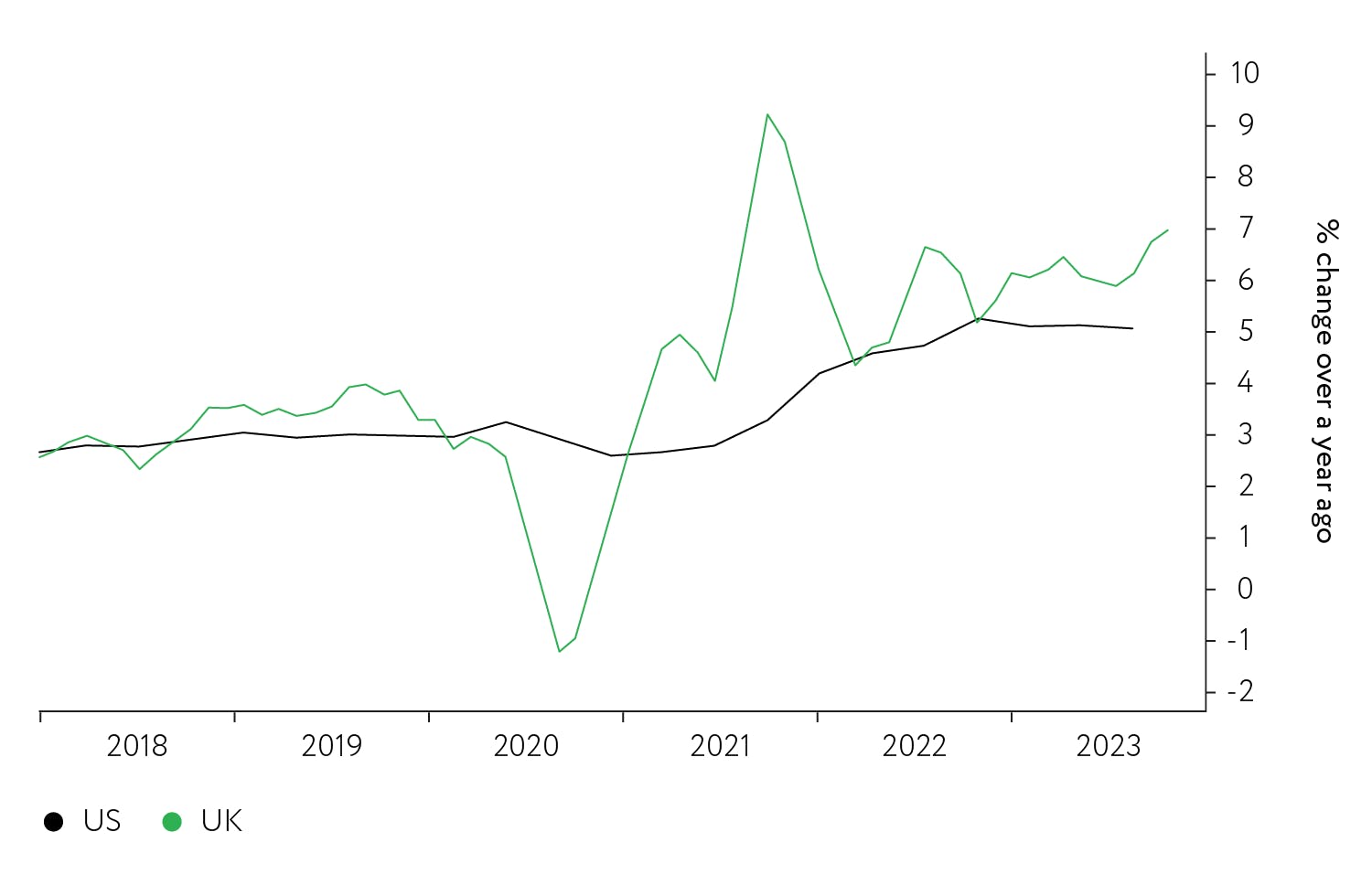
Indeed, the core rate of inflation (removing energy and food) has yet to fall significantly in the UK, while deceleration in US core inflation is quite well established, as chart 1 demonstrates.
What are the reasons for this differing inflation picture – and what does it mean for financial markets?
Let’s look at what the data is telling us.
Chart 1. Headline and core inflation is declining faster in the US than the UK
UK CPI vs US CPI percentage change over 12 months, and UK Core CPIH vs US Core CPI percentage change over 12 months, 2018 to 2023
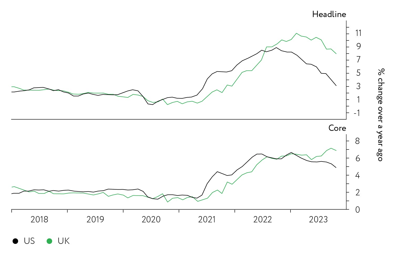
Source: Macrobond, Nutmeg, July 2023
As chart 2 shows, UK goods inflation peaked at a comparable level to the US, although the peak came later and has taken longer to decline.
Chart 2. The UK has more goods in its CPI basket than the US
UK goods inflation vs US goods inflation, percentage change over 12 months, and UK services inflation vs US services inflation, percentage change over 12 months, 2018 to 2023
Source: Macrobond, Nutmeg, July 2023
Since the UK consumer basket has a higher goods component (53% compared to 38% in the US), goods prices inflation has made a more material contribution to overall inflation.
The middle panel in chart 3 demonstrates this. UK inflation peaked at 11%, and over 8% of that was due to goods inflation. By contrast, only 5% of the 9% US inflation peak was goods related. The top panel of chart 3 shows that the volatile elements of the UK consumer basket (mainly food and energy goods) accounted for 6% of the 8% goods contribution to CPI.
Chart 3. Goods and non-core inflation was more pronounced in the UK than the US
UK non-core inflation vs US non-core inflation, percentage change over 12 months, UK goods inflation vs US goods inflation, percentage change over 12 months, and UK services inflation vs US services inflation, percentage change over 12 months, 2018 to 2023
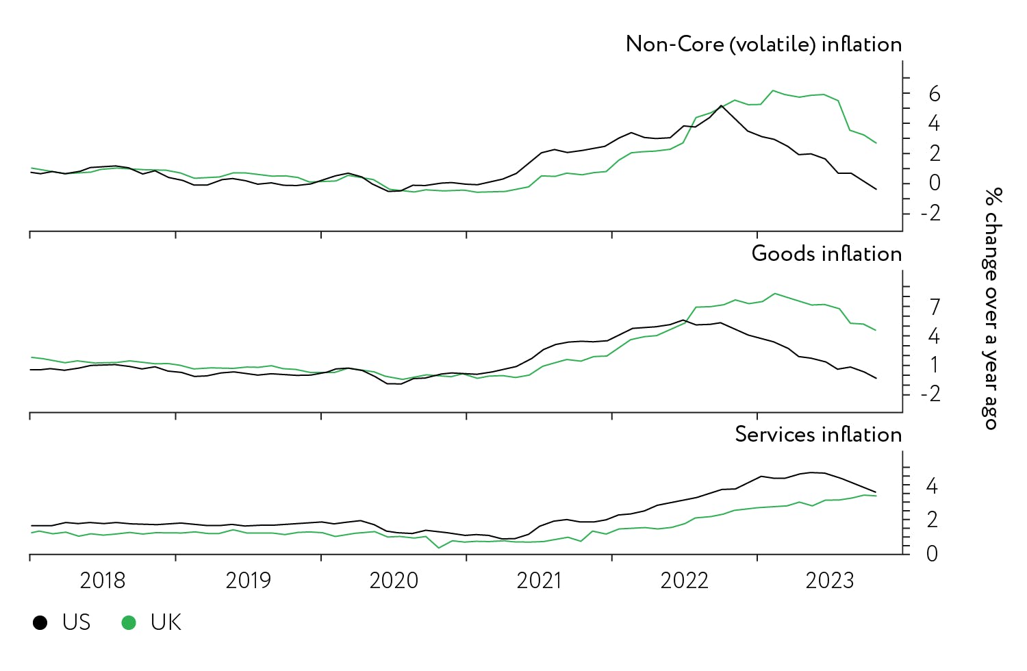
Source: Macrobond, Nutmeg, July 2023
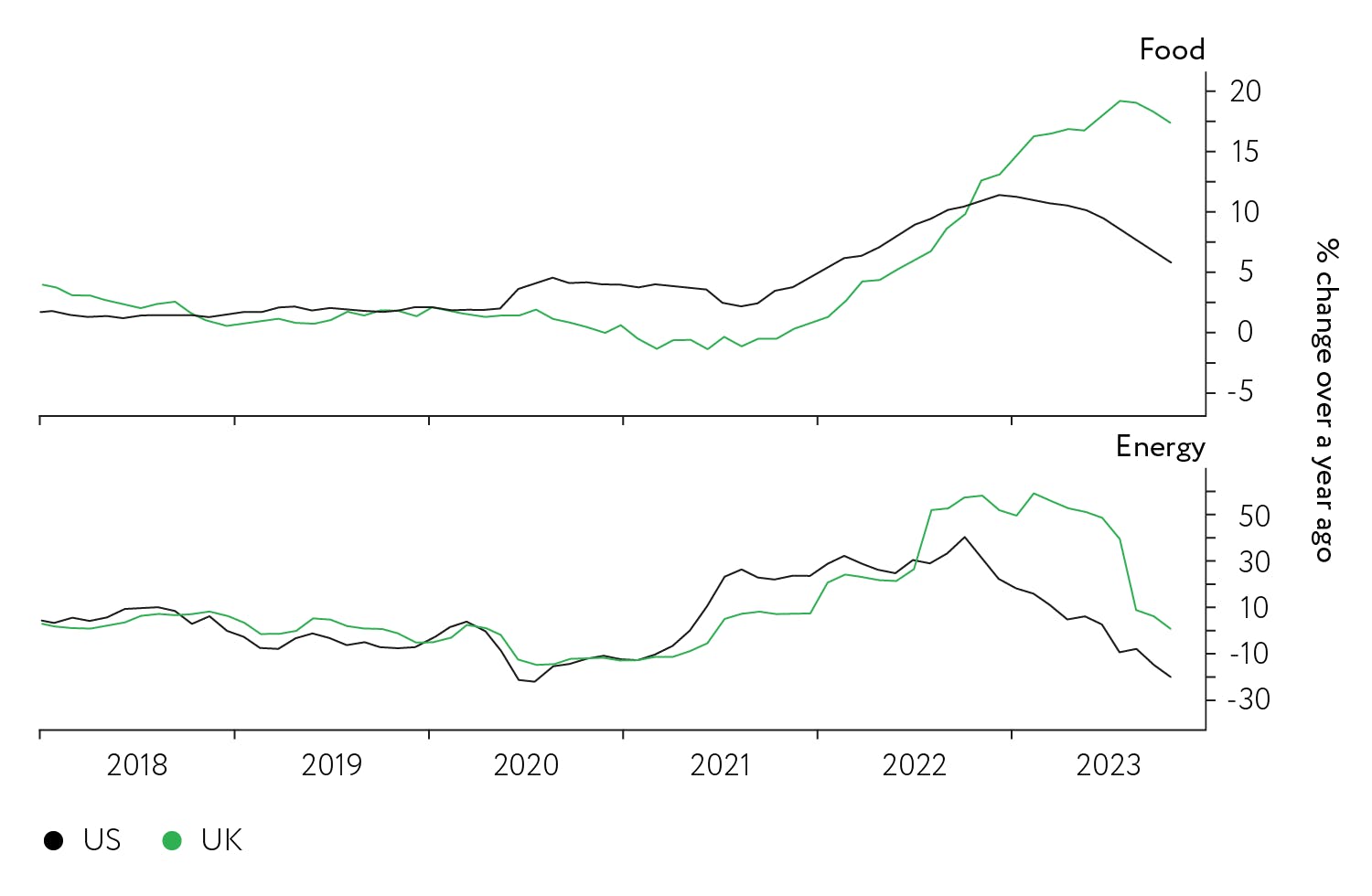
Chart 4 shows that the UK had a much larger and longer price shock in the volatile food and energy components compared to the US.
Chart 4. Food and energy costs were higher for longer in the UK
UK food inflation vs US food inflation, percentage change over 12 months, and UK energy inflation vs US energy inflation, percentage change over 12 months, 2018 to 2023
Source: Macrobond, Nutmeg, July 2023
Businesses and employees want more!
One explanation for the larger goods price shock in the UK seems to be generally lower competition. This can be seen in chart 5, which shows that profit margins in the goods sector have been boosted faster in the UK than in the US. UK goods sector businesses seem unworried about losing market share when they boost their profits through price rises.
Chart 5. Profits surge among goods retailers, particularly in the UK
Profit margin of US vs UK goods retailers, percentage change over 12 months, 2018 to 2023
Source: Macrobond, Nutmeg, July 2023
Even when we come to talk about services sector inflation, the UK comes off second best.
An important difference between the US and UK inflation basket is the heavier weight of housing costs in the US index, which adds over 1.5% more to US CPI compared to than in the UK.
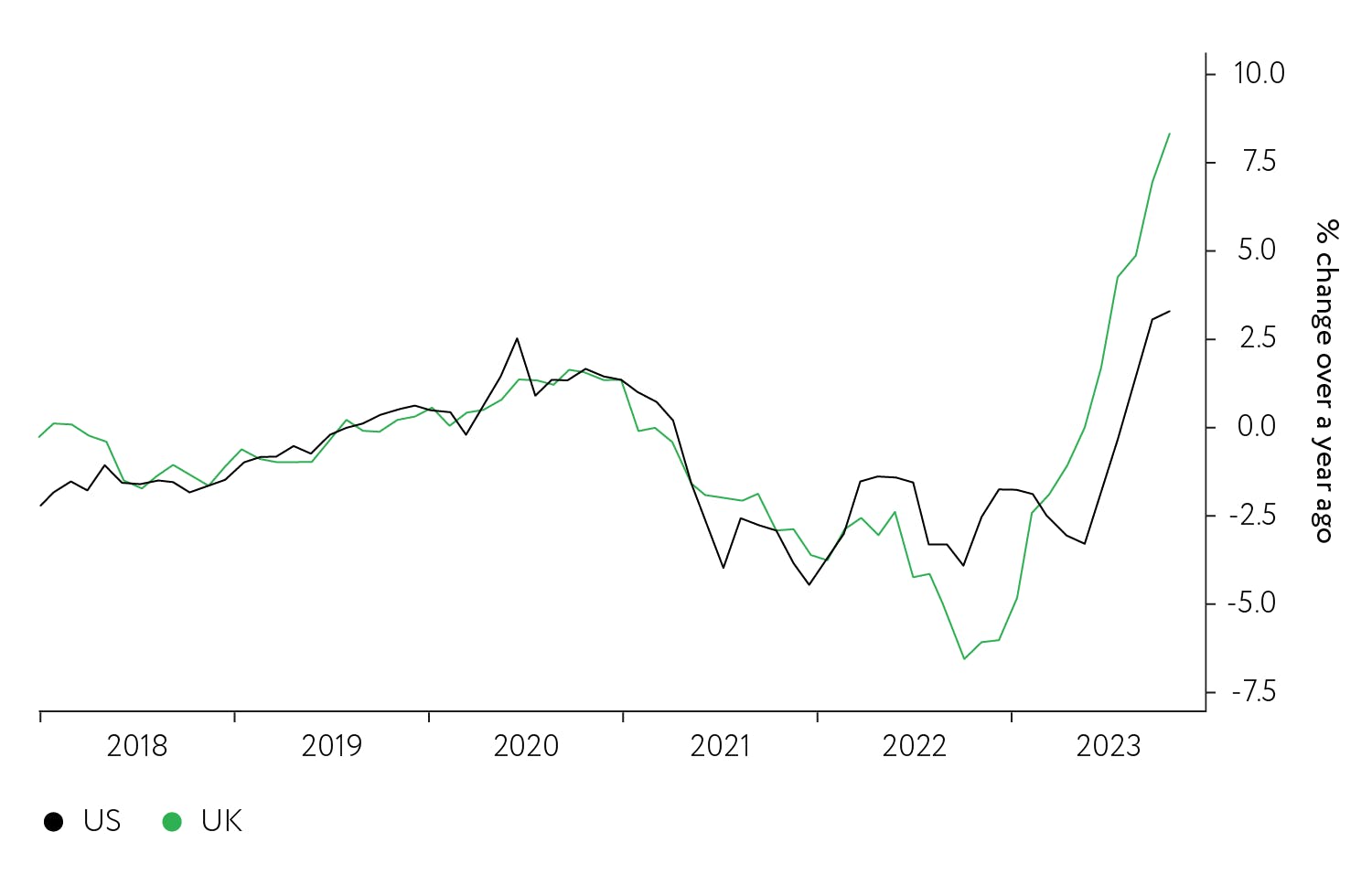
Despite this relative US price pressure, services inflation pressure is reducing in the US, but not in the UK, as shown in chart 3 above. Something else really must be pushing up UK services prices, and chart 6 shows that ‘something else’ is relative wages. Tighter and less-flexible labour markets have produced higher wage pressure in the UK, keeping the cost bases of UK service businesses rising.
Chart 6. UK earnings remain elevated, while US earnings have plateaued
UK average weekly earnings vs US employment cost index, percentage change over 12 months, 2018 to 2023
Source: Macrobond, Nutmeg, July 2023
What does this mean for financial markets?
The Bank of England has a larger inflation problem than the US Federal Reserve. It’s likely that the Bank will feel the need to raise rates further until core inflation (and services inflation in particular) declines.
Financial markets are trying to assess just how far the Bank of England and Federal Reserve need to tighten. But a key concern for the Bank of England is the behaviour of key elements in the economy which are seeking to extract higher profits or wages. This behaviour has been labelled ‘greedflation’. It will delay the point at which the Bank will be happy to call an end to the present policy tightening phase. The risk continues to be that tighter policy may weaken economic prospects and so undermine equity returns.
We are monitoring these outcomes very closely and with the positioning of the Nutmeg portfolios in mind. We’ll continue to keep you updated with our news, views, and any changes we make to the allocation of your portfolio.
For more insight and analysis from the investment team, click here, or subscribe to our YouTube channel for regular updates.
Risk warning
As with all investing, your capital is at risk. The value of your portfolio with Nutmeg can go down as well as up and you may get back less than you invest. Past performance is not a reliable indicator of future performance.